Saturday, October 16, 2010

Design Synthesis


This course has helped me to synthesise the history of design with the practise of design. I am now more aware of the design around me and am able to recognise styles within it such as Rococo or Classicism. I think it was important to learn the history of design and the practise of it to be able to apply it to my own design, but to also inform my thinking and choices regarding design.


I have not been significantly influenced by learning about the history and theory of design, but I do notice that the way I view things has changed, so in that respect this course has changed how I approach design. I now have new styles to consider to include or incorporate in my own work which may make my design something more than others or make my design stand out or be a little bit more innovative.


I think that this class was helpful for the above reasons. It was also something I think was necessary to understand, as designers it is important to understand and recognize mistakes made in the past in order to progress and move forward. However I think there was so much information to take in every lecture that it was difficult to sometimes order what was and wasn't relevant enough to take down in my notes. It was difficult to take notes at some points as I found that the length of the lecture was very long, especially as it was on a Wednesday afternoon, the day which I would have an early morning lecture for DSDN141 and then a 3 hour studio in the middle. By the end of the day I felt worn out and the length of the lecture combines with the quantity of information per lecture made it difficult to pay attention at times. Other than this I thought that Design in Context was an interesting class.

Saturday, October 2, 2010

The Manchester Methodist Housing Project

Images taken from: www.dhub.org/articles/835

The Manchester Methodist Housing Project (part of the New Isslington Millinium Community) is an example of remix design through architecture. The roof can clearly be related to design reform the 19th century. It is easy to see Gothic styles in the design. For example the tall triangular steeple shaped faces and the intricate circular symmetrical shapes. These shapes and styles are also seen in Pugins work as he was interested in Gothic design. The use of the chapel style face and the cathedral like carvings is witty as the design was designed for Methodists, a type of christian religion.


However the designs haven't been used in their 'traditional' form, instead they have been 'remixed' into a more modern and forward thinking design. The designs sit atop an angular and geometric building and instead of being part of the structure seem to cover it. This makes them ornamental and not functional which mixes in another design style into the design.


Bright Orange is also used in stark contrast to the clean white. It is interesting as white is a clean and pure colour, it was popular in modernist design whereas colours like bright orange were popular among psychedelia which was part of post modern design. Post modern design was in direct contrast to modernist design and used the slogan 'less is a bore'.


It is also interesting to note that the architects for this project come from a company which goes by the name FAT which stands for Fashion Architecture Taste, fashion was also a big part of postmodern design as pop culture such as fashion and music was highly influenced/influential to postmodern/remix design. For this project FAT architects said they wanted to explore "British tradition" but in a way which was "different to what everyone else was doing".


A full view of the housing project

Saturday, September 25, 2010

Politically Informed Design

Jessica Alba in 'Declare Yourself' photo by: Mark Lidell


One of the types of political branding that effects design the world over is the issue of voting. Many countries still don't have a fair voting system, the right to vote or any form of voting at all. However in countries like New Zealand and the States we have a fair and democratic right to vote.


A campaign in which politically informed design was evident was the 'Declare Yourself' campaign of the United States, which reached full peak in late 08 and early 09. The campaign was to try and get young people of the voting age to register to vote. It featured many celebrities including Jessica Alba as pictured above. The images were designed so that the models in them were 'silenced' this was usually due to bonds or gags. The slogan was 'only you can silence yourself'.


I think that the campaign was well designed and represented/tried to combat an important issue currently in our world, because as mentioned above many countries do not have a fair voting system or any form of democracy.


The design itself is a play on these issues, because in some countries it is not uncommon for people with differing political opinions to be silenced.

Saturday, September 18, 2010

Who is Ashleigh the designer?

Hat design showcasing my own design background


It is a very strange question to be asked 'who are you as a designer' and many people will sit around and wonder exactly how best to answer that. I am an 18 year old female of New Zealand European decent. Does this mean that my designs would be influenced by my European heritage? I admit I love Gaelic designs and find them very appealing and I have used them in designs before. But I feel no patriotism to my Anglo-Irish Scottish heritage and I view myself as a New Zealander.

I lived in Australia for some time and I love the aboriginal culture there. Their depictions of animals are as beautiful as they are unique and perhaps this will come into play during my life as a designer one day. I lived in Australia as my father was a member of the Royal New Zealand Air Force and he had been posted there. My mother too has served in the defence force although she was in the Army. So my background has been full of exposure to military lifestyles and inspired my love for aviation. Aviation and things to do with that will shape who I am as a designer as there is a lot to be gained from not just the sky and planes but from the emotions that they evoke in me.

Another strong influence that shapes who I am as a designer is my education so far. I spent 5 years studying Fashion Design at college. I learnt about how textures correspond to one another, about colours and about proportions and geometry of the human body. In my experiences of first year design here at Vic I have used some of the things I learnt and they have been to good use. So I find that applying this textile knowledge has given me something unique to put forward and showcase.

Saturday, September 11, 2010

Technology and Progess: The Bauhaus

Some particular philosophies stood out for me when looking at the Bauhaus and my own experiences with the School of Architecture and Design (SOAD). I have only been studying at the school since the start of semester 2 and have never done anything in the field of design apart from textile design, which is very different.

Things I noticed when I first arrived at the School were that Lecturers and Tutors try their best to make you think outside the square. The Design course 141 is especially adherent to the philosophies that Johannes Itten brought to the Bauhaus. The Lecturer encourages all the students to feel and view materials which would be used in design in a more abstract and interesting way and accepts their perceptions of these, especially through the use of photography. This is similar to Itten who believed that everyone's perceptions were different.

I also think that the SOAD has a strong connection with modern technologies linking progression and forward thinking with digitization. My understanding is that the School encourages students to use different technologies to create exciting compositions and designs. Much like the ideals that Maholy-Nagy had. However like Maholy-Nagy the school doesn't put the focus of the composition on the technology rather encourages the use of technology to produce innovative ideas.

Also like Maholy-Nagy it seems that the School is interested in the designing of 3D compositions and objects and the exploration of the spaces around and inside materials. For example when walking into the school for the first day of semester 2 the ground floor was filled with composition boxes made of wood. They were carved differently and all showed spatial exploration.

Thursday, August 5, 2010

Contemporary Craft


Craft is the functioning side of an object, a side which despite time will never completely change. Craft draws on tradition, making and constructing an object which is easily recognizable as what it is meant to be. Design and craft were separate ideals which in contemporary times are now becoming closely linked. Especially in modern craft where design is a large part of how an object is crafted. For example Barb Campbell is a self trained ceramic artist who crafts pieces which are inspired by nature. The jug pictured above is an example of contemporary craft as it is clearly a crafted, one of a kind jug but one which is traditional in form. Campbell wanted it to be "expressive and functional as a means to enhance everyday life". I believe it is a contemporary expression of craft as design principles brought about by the likes of Ruskin and Moriss have been included in the creation of the object bringing together both design and craft which makes the object functional but visually attractive.


The photo above is a photo of a ceramic jug crafted by Barb Campbell

Thursday, July 29, 2010

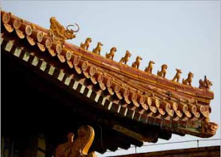
Decorated Construction: The Forbidden City


In Owen Jones The Grammar of Ornament he is trying to convey the idea that something should be built then decorated and not built to be decoration. I believe that what he is trying to convey is correct as an object or thing needs to function in order for it to meet its purpose. When this idea is not used we begin to get objects that fail at their purpose e.g. Meissonier's candelabra of 1734.


Decoration should be used as a way to make something constructed more visually pleasing. For example an office complex built in a city will be constructed with cold, grey, unattractive concrete and iron framing. It is unappealing and ugly. However when decoration in the form of glass panels and paint is used the building can become beautiful and marvelous - but it is still an office building which is fit for its purpose.


An example of decorated construction can more clearly be seen in the likes of Chinese architecture and more specifically the Forbidden City. The buildings which make up the city were built to house and protect the emperors of China and were used in this was for over 500 years. To make the buildings more attractive and to showcase the wealth and might of the imperial family they were decorated with gold dragons and other mythical creatures, as well as intricate hand carvings and statues. Without this decoration the City would be bare and plain. But as the City is an example of decorated construction the buildings in the City are beautiful and marvelous but also served their purpose well.


Image: A roof from a building in the Forbidden City, Beijing, China